
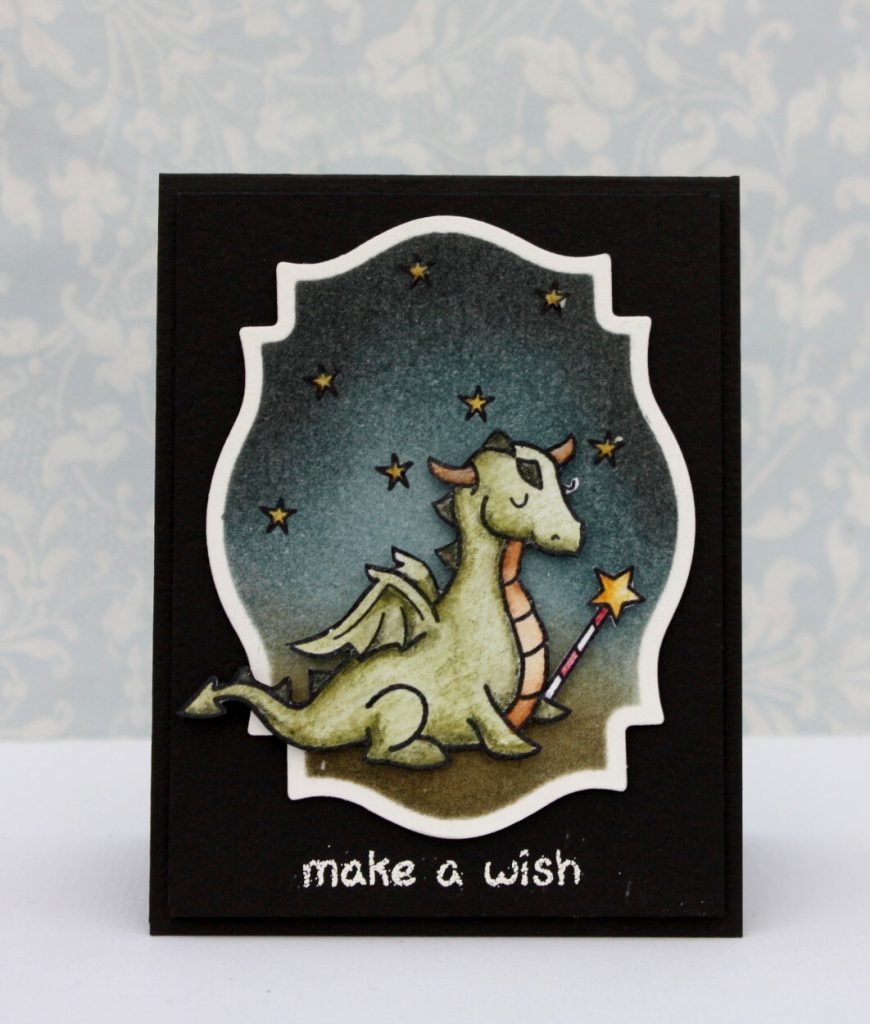
Today we have a fun treat! Our friend Karin is showing us how she creates her gorgeous night skies with Distress Inks. Her card was one of our CHA catalog contest winners, and this video was a big request!
You can watch the video here or on our YouTube channel!
Thank you so much for watching!
Thank you so much for sharing this gorgeous technique with us, Karin! We appreciate it!

Thank you so much for visiting!
Have an amazing day,

Very cool! Thanks Karin for the video!!
Love, love, love Karin's cards and projects!!
So…totally love this video!!
Awesome coloring!! wow! Thanks so much for sharing!!
Oh, I saw this in person at CHA and was awestruck! Thanks to Karin for sharing her awesome technique – I will definitely be attempting this soon! 🙂
Great video tutorial, Karin! Thanks so much.
Mesmerizing work, Karin! I loved watching you create your signature background~thank you for sharing your secret!!!
That came out so pretty. Now we know her secret to beautiful starry-sky backgrounds. Fabulous Karin. Thank you for showing us your technique.
Terrific video, Karin – thanks so much for sharing your technique with everyone. I especially like the way you layered the colour to achieve the look of your starry sky. Beautiful work!
Great video tutorial! I love it–I must try it soon!
It looks great! But every time I try this it doesnt blend as smooth as yours. In fact, it doesnt blend at all the sponge just makes a mark on my page.. 🙁
Karin replied below on the post. We hope that helps!
With the Distress Ink foam applicator, you need to start blending in a circular motion off the paper and then move on to the paper. Or else you see a dark square sponge mark. Maybe this is the problem for Steph?
Thanks everyone for your sweet comments – means extra much since it was my first try at making a video tutorial !
Steph, have you tried different kinds of paper? Maybe some papers are too pourous (is that how you spell it???!!! It is tough being Swedish sometimes (-:) and it might suck up the ink too fast. I used watercolorpaper here. Would love to hear from you if you tried it and if that made it easier or not.
Your cards are beautiful! Thank you so much for sharing this technique with us.
cute! love the white edge and the sky!
Great video, Karin! I loved watching you work your magic. Thank you for showing us your technique!
Wonderful tutorial! Soo easy to follow. Adoreable card and stampset you showcased too!!!
Beautiful effect! Thanks so much for sharing!
Such a good video, Karin! Loved watching you work. Distress Inks give such a nice effect. Thanks for sharing with us. 🙂
Love this! Looks like a children's book illustration…
Great video! Thanks for sharing your technique, Karin. 😉
Beautiful card! I love Tim's distress inks and this technique is one of my favorites! From my experience yes, the paper has made a difference in the blending. Neenah cardstock allows it to blend very smoothly. Also the slickness of the Ranger craft sheet and starting on the sheet first and working onto the image as was stated previously helps it blend nicely. Thanks for sharing!
Great video! Thanks for showing all the colors ahead of time too – that was very helpful.
Magical! Thanks for the video Karin..It was great hearing your voice:)
It’s summer of 2020 and here we are in the middle of a pandemic which has me home and back into stamping and papercrafting! I just discovered you on YouTube, followed you to your blog and now I’m subscribed to your updates. Thank you for sharing this great, accessible inking technique for a dreamy night sky! OOXOO